Python has revolutionized data visualization by providing powerful, flexible tools that transform complex data sets into compelling visual narratives. Unlike traditional approaches limited to Excel spreadsheets or proprietary software like Tableau, Python offers unparalleled control over every aspect of data visualization—from basic bar charts and line graphs to sophisticated interactive dashboards and real-time data monitoring systems.
Python’s extensive ecosystem of data visualization libraries enables organizations to create everything from simple pie charts to complex heat maps, scatter plots, and bubble charts. This collection of libraries supports all types of data visualization techniques, empowering data scientists and analysts to present data in ways that drive meaningful decision-making across enterprise environments.
The integration of Python with modern AI platforms has further enhanced these capabilities, enabling automated insights, intelligent chart recommendations, and advanced data storytelling features that make good data visualization accessible to broader organizational audiences while avoiding common pitfalls that lead to bad data visualization outcomes.
Why Python Leads in Enterprise Data Visualization
Python’s dominance in data visualization stems from its unique combination of simplicity, power, and extensibility. Unlike restrictive tools that limit users to predefined templates and chart types, Python provides complete control over visual elements, data processing workflows, and interactive features that support sophisticated business intelligence applications.
Python is known as a more readable and accessible language, while its extensive library ecosystem enables virtually any visualization requirement users might have. From basic column charts and histograms to advanced treemaps and network diagrams, Python supports every conceivable type of chart and visualization technique.
Python’s ability to handle big data processing seamlessly integrates with visualization workflows, enabling users to perform real-time data analysis and create dashboards that can process millions of data points without slowing down. This is particularly valuable when creating interactive data visualization applications that need to respond instantly to user interactions and data updates.
Moreover, Python’s integration with modern AI platforms offers capabilities like intelligent automation, predictive analytics, and advanced user experience optimization that transforms how organizations approach data storytelling and decision-making processes.
Essential Python Libraries for Data Visualization
Matplotlib: The Foundation of Python Visualization
Matplotlib serves as the cornerstone of Python data visualization, providing comprehensive control over every visual element. This library excels at creating publication-quality static visualizations, including line charts, bar graphs, scatter plots, and histograms with precise y-axis scaling and customization options.
import matplotlib.pyplot as plt

import numpy as np

# Create sample data

x = np.linspace(0, 10, 100)

y = np.sin(x)

# Create line chart

plt.figure(figsize=(10, 6))

plt.plot(x, y, linewidth=2)

plt.title('Time Series Analysis Example')

plt.xlabel('Time')

plt.ylabel('Value')

plt.grid(True)

plt.show()
This code snippet will yield the following plot:
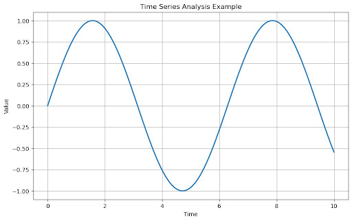
Matplotlib’s strength lies in its granular control over visual elements, making it ideal for creating standardized reports, regulatory compliance documentation, and presentations where precise formatting requirements must be met.
Seaborn: Statistical Visualization Made Simple
Seaborn builds upon Matplotlib’s foundation while simplifying the creation of statistical visualizations. It excels at generating heat maps, correlation matrices, and demographic analysis charts with elegant styling that produces effective data visualization with minimal code.
import seaborn as sns

import pandas as pd

import matplotlib.pyplot as plt

# Load sample data

tips = sns.load_dataset("tips")

# Create correlation matrix

plt.figure(figsize=(8, 6))

correlation_matrix = tips.corr(numeric_only=True)

sns.heatmap(correlation_matrix, annot=True, cmap='coolwarm')

plt.title('Restaurant Tips Correlation Analysis')

plt.show()
This code will yield the following plot:
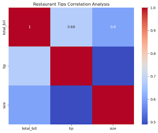
Seaborn particularly shines in exploratory data analysis, enabling rapid creation of visualizations that reveal patterns, outliers, and relationships within complex data sets.
Plotly: Interactive Data Visualization Excellence
Plotly specializes in creating interactive data visualization applications that support real-time data exploration and user engagement. This library enables the development of sophisticated dashboards that handle big data processing while maintaining responsive user experiences.
import plotly.express as px

df = px.data.gapminder()

# Create interactive scatter plot

fig = px.scatter(

    df,

    x='gdpPercap',

    y='lifeExp',

    title='Global Demographics Analysis',

    size='pop',

    color='continent',

    hover_name='country',

    size_max=60,

)

fig.show()
This code will yield the following plot:
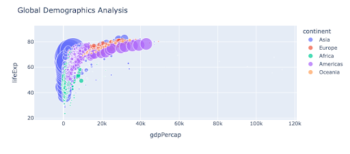
Plotly’s strength lies in creating interactive dashboards that enable stakeholders to explore data points dynamically, supporting data-driven decisions through enhanced user experience and real-time metrics monitoring.
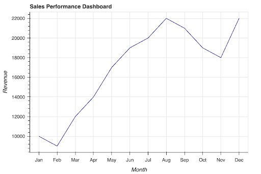
Bokeh: Web-Ready Interactive Visualizations
Bokeh focuses on creating interactive visualizations optimized for web deployment, making it ideal for developing enterprise dashboards and business intelligence applications that need to serve multiple users simultaneously.
from bokeh.plotting import figure, show

from bokeh.models import HoverTool

from bokeh.io import output_notebook

output_notebook() # Add this line if you are running the code in a notebook

months = ['Jan', 'Feb', 'Mar', 'Apr', 'May', 'Jun', 'Jul', 'Aug', 'Sep', 'Oct', 'Nov', 'Dec']

revenue = [10000, 9000, 12000, 14000, 17000, 19000, 20000, 22000, 21000, 19000, 18000, 22000]

# Create figure object

p = figure(

    title="Sales Performance Dashboard",

    x_range=months,

    x_axis_label='Month',

    y_axis_label='Revenue',

    height=400,

)

# Add hover tool for enhanced interactivity

hover = HoverTool(tooltips=[('Month', '@x'), ('Revenue', '@y')])

p.add_tools(hover)

# Add data points

p.line(months, revenue, color='navy')

show(p)
This code will yield the following plot:
Five Python Data Visualization Examples Across Industries
1. Financial Services: Real-Time Risk Assessment Using Python
Financial institutions leverage Python’s time series visualization capabilities to monitor market volatility and assess risk exposure through sophisticated data analytics. Python’s ability to process real-time data streams enables users to create dynamic dashboards that update continuously as market conditions change.
import pandas as pd

import matplotlib.pyplot as plt

stock_data = pd.read_csv('stock_prices.csv', parse_dates=['date'])

# Create multi-panel dashboard

fig, axes = plt.subplots(2, 2, figsize=(15, 10))

# Price trend line chart

axes[0,0].plot(stock_data['date'], stock_data['price'])

axes[0,0].set_title('Stock Price Trend')

axes[0,0].set_ylabel('Price ($)')

# Volume bar chart

axes[0,1].bar(stock_data['date'], stock_data['volume'])

axes[0,1].set_title('Trading Volume')

axes[0,1].set_ylabel('Volume')

# Risk metrics heat map

risk_matrix = stock_data[['volatility', 'beta', 'sharpe_ratio']].corr()

im = axes[1,0].imshow(risk_matrix, cmap='RdYlBu')

axes[1,0].set_title('Risk Correlation Matrix')

# Portfolio allocation pie chart

sectors = ['Tech', 'Finance', 'Healthcare', 'Energy']

allocations = [35, 25, 20, 20]

axes[1,1].pie(allocations, labels=sectors, autopct='%1.1f%%')

axes[1,1].set_title('Portfolio Allocation')

plt.tight_layout()

plt.show()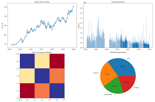
This comprehensive dashboard demonstrates how Python enables financial analysts to combine multiple visualization types—line graphs, bar charts, heat maps, and pie charts—into unified analytical tools that support decision-making processes during volatile market conditions.
2. Healthcare: Patient Analytics and Pandemic Response
Healthcare providers use Python’s data visualization capabilities to analyze patient demographics, track treatment outcomes, and respond to public health challenges. During the COVID-19 pandemic, Python-based visualizations became critical for monitoring infection rates, resource allocation, and population density impacts on disease transmission.
import numpy as np

import pandas as pd

import plotly.graph_objects as go

from plotly.subplots import make_subplots

rng = np.random.default_rng(42)

# --- Simulated data ---

patient_data = pd.DataFrame({

    "age": rng.integers(18, 90, 300),

    "treatment_duration": rng.gamma(2.0, 5.0, 300).astype(int).clip(1, None),

    "recovery_rate": np.clip(np.round(rng.normal(0.85, 0.08, 300), 2), 0.4, 1.0),

})

geo_data = pd.DataFrame({

    "state": ["CA","TX","NY","FL","IL","PA","OH","GA","NC","MI"],

    "case_rate": np.round(rng.uniform(100, 2000, 10), 2)

})

# --- Layout ---

fig = make_subplots(

    rows=2, cols=2,

    subplot_titles=('Patient Age Distribution', 'Treatment Outcomes',

                    'Geographic Spread', 'Resource Utilization'),

    specs=[[{'type': 'bar'}, {'type': 'scatter'}],

           [{'type': 'geo'}, {'type': 'pie'}]]

)

# --- Traces ---

fig.add_trace(go.Histogram(x=patient_data['age'], name='Age', showlegend=False), row=1, col=1)

fig.add_trace(go.Scatter(x=patient_data['treatment_duration'], y=patient_data['recovery_rate'],

                         mode='markers', name='Outcomes', showlegend=False), row=1, col=2)

fig.add_trace(go.Choropleth(locations=geo_data['state'], z=geo_data['case_rate'],

                            locationmode='USA-states', colorscale='Plasma',

                            colorbar=dict(title='Cases / 100k', x=0.44, xanchor='left',

                                          y=0.03, yanchor='bottom', len=0.4, thickness=12)),

              row=2, col=1)

fig.add_trace(go.Pie(labels=['ICU', 'General', 'Emergency', 'Outpatient'],

                     values=[30, 40, 15, 15], showlegend=False, textinfo='percent+label'),

              row=2, col=2)

# --- Axes / geos ---

fig.update_xaxes(title_text="Age (years)", row=1, col=1)

fig.update_yaxes(title_text="Number of Patients", row=1, col=1)

fig.update_xaxes(title_text="Treatment Duration (days)", row=1, col=2)

fig.update_yaxes(title_text="Recovery Rate", row=1, col=2)

fig.update_geos(scope='usa', row=2, col=1)

# --- Title / margins ---

fig.update_layout(

    title='Healthcare Analytics Dashboard', height=800,

    margin=dict(t=90, r=20, l=20, b=20)

)

fig.show()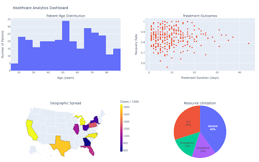
This example illustrates how Python’s flexibility enables healthcare organizations to create comprehensive analytical tools that combine different types of data visualization to support clinical decision-making and resource planning.
3. Retail and E-commerce: Customer Journey Optimization with Python
Retail organizations leverage Python’s data visualization capabilities to understand customer behavior, optimize conversion funnels, and analyze social media engagement patterns. Python’s ability to integrate multiple data sources enables comprehensive customer analytics that drive data-driven decisions.
import numpy as np

import pandas as pd

import seaborn as sns

import matplotlib.pyplot as plt

import matplotlib.dates as mdates

rng = np.random.default_rng(42)

sns.set_theme(style="whitegrid")

# ---------- Simulated data ----------

customer_data = pd.DataFrame({

    "age_group": rng.choice(["18-25", "26-35", "36-50", "51+"], 400, p=[.25, .35, .25, .15]),

    "frequency": rng.poisson(5, 400),

    "monetary_value": rng.gamma(2.2, 180, 400).round(2),

})

customer_data["customer_segment"] = pd.qcut(customer_data["monetary_value"], 3, labels=["Low","Mid","High"])

sales_data = pd.DataFrame({

    "date": pd.date_range("2025-01-01", periods=120, freq="D"),

    "revenue": np.cumsum(rng.uniform(800, 3500, 120)),

})

product_data = pd.DataFrame({

    "category": ["Electronics", "Clothing", "Home", "Toys"],

    "sales": rng.uniform(10_000, 50_000, 4),

})

social_data = pd.DataFrame(

    [(p, c, rng.uniform(0.5, 12))

     for p in ["Twitter", "Instagram", "Facebook"]

     for c in ["Video", "Image", "Text"]],

    columns=["platform", "content_type", "engagement_rate"]

)

# ---------- Plots ----------

fig, axes = plt.subplots(2, 3, figsize=(18, 12))

# Age demographics

sns.countplot(data=customer_data, x="age_group", ax=axes[0, 0])

axes[0, 0].set_title("Customer Age Demographics")

axes[0, 0].set_xlabel("Age Group")

axes[0, 0].set_ylabel("Count")

# Purchase behavior

sns.scatterplot(

    data=customer_data, x="frequency", y="monetary_value",

    hue="customer_segment", ax=axes[0, 1], s=35, alpha=0.8

)

axes[0, 1].set_title("Purchase Behavior Analysis")

axes[0, 1].set_xlabel("Purchase Frequency")

axes[0, 1].set_ylabel("Monetary Value")

axes[0, 1].legend(title="Segment", loc="best")

# Conversion funnel

funnel_stages = ["Visitors", "Product Views", "Cart Adds", "Purchases"]

funnel_values = [100_000, 45_000, 12_000, 3_500]

axes[0, 2].bar(funnel_stages, funnel_values)

axes[0, 2].set_title("Conversion Funnel")

axes[0, 2].set_ylabel("Users")

# Revenue trend

sns.lineplot(data=sales_data, x="date", y="revenue", ax=axes[1, 0])

axes[1, 0].set_title("Revenue Trend")

axes[1, 0].set_xlabel("Date")

axes[1, 0].set_ylabel("Revenue")

loc = mdates.AutoDateLocator()

axes[1, 0].xaxis.set_major_locator(loc)

axes[1, 0].xaxis.set_major_formatter(mdates.ConciseDateFormatter(loc))

# Category performance

sns.barplot(data=product_data, x="category", y="sales", ax=axes[1, 1])

axes[1, 1].set_title("Category Performance")

axes[1, 1].set_xlabel("Category")

axes[1, 1].set_ylabel("Sales")

# Social engagement heatmap

engagement_matrix = social_data.pivot_table(

    index="platform", columns="content_type", values="engagement_rate", aggfunc="mean"

)

sns.heatmap(engagement_matrix, annot=True, fmt=".2f", ax=axes[1, 2])

axes[1, 2].set_title("Social Media Engagement")

axes[1, 2].set_xlabel("Content Type")

axes[1, 2].set_ylabel("Platform")

plt.tight_layout()

plt.show()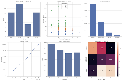
4. Manufacturing: Operational Analytics and Automation Monitoring
Manufacturing organizations use Python to create sophisticated operational dashboards that monitor production efficiency, equipment performance, and automation systems. These visualizations help identify outliers, optimize processes, and prevent equipment failures. Learn more about the hvPlot library on GitHub.
# Manufacturing

import pandas as pd, numpy as np

import hvplot.pandas  # noqa

# ---------- Simulated Data ----------

production_data = pd.DataFrame({

    "hour": range(24),

    "efficiency": np.round(0.7 + 0.2*np.sin(np.linspace(0, 2*np.pi, 24)), 3)

})

equipment_data = pd.DataFrame({

    "machine": [f"M{i}" for i in range(1,6)],

    "uptime": np.random.uniform(80, 99, 5)

})

quality_data = pd.DataFrame({"defect_rate": np.random.exponential(0.01, 200)})

maintenance_data = pd.DataFrame({

    "date": pd.date_range("2025-02-01", periods=15, freq="D"),

    "scheduled_hours": np.random.uniform(2, 10, 15)

})

resource_data = pd.DataFrame({

    "resource": ["Labor", "Materials", "Energy", "Logistics"],

    "allocation": [35, 25, 25, 15]

})

automation_data = pd.DataFrame({

    "status": ["Automated", "Manual"],

    "share": [70, 30]

})

# ---------- Individual Plots ----------

eff_plot = production_data.hvplot.line(

    x="hour", y="efficiency", title="Production Efficiency",

    xlabel="Hour", ylabel="Efficiency"

)

equip_plot = equipment_data.hvplot.bar(

    x="machine", y="uptime", title="Equipment Performance",

    xlabel="Machine", ylabel="Uptime (%)"

)

quality_plot = quality_data.hvplot.hist(

    y="defect_rate", bins=20, title="Quality Metrics",

    xlabel="Defect Rate", ylabel="Count"

)

maint_plot = maintenance_data.hvplot.area(

    x="date", y="scheduled_hours", alpha=0.6,

    title="Maintenance Schedule", xlabel="Date", ylabel="Scheduled Hours"

)

resource_plot = resource_data.hvplot.barh(

    x="resource", y="allocation", stacked=True,

    title="Resource Utilization",

    ylabel="%",

)

automation_plot = automation_data.hvplot.barh(

    x="status", y="share",

    title="Automation Status", ylabel="%",

)

# ---------- Layout ----------

dashboard = (eff_plot + equip_plot + quality_plot + maint_plot + resource_plot + automation_plot).cols(2).relabel("Manufacturing Operations Dashboard")

dashboard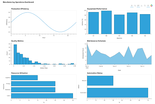
5. Technology: User Experience and Performance Monitoring
Technology companies leverage Python’s visualization capabilities to monitor application performance, user engagement metrics, and system reliability through comprehensive business intelligence dashboards that process real-time data streams.
import numpy as np

import pandas as pd

import panel as pn

import hvplot.pandas  # noqa

pn.extension(sizing_mode="stretch_width")

rng = np.random.default_rng(42)

# ---- Simulated data ----

N = 800

regions = np.array(["us-east", "us-west", "eu-west", "ap-south"])

region = rng.choice(regions, N, p=[0.35, 0.25, 0.25, 0.15])

rt_base  = {"us-east": 120, "us-west": 160, "eu-west": 180, "ap-south": 220}   # ms

cap_base = {"us-east": 1400, "us-west": 1200, "eu-west": 1100, "ap-south": 900} # rps

rt = np.clip(np.array([rng.normal(rt_base[r], 40) for r in region]), 40, 800)

cap = np.array([cap_base[r] for r in region])

th = np.clip(cap * (200 / (rt + 50)) + rng.normal(0, 70, N), 50, 1800)

er = np.clip(0.002 + 0.0006*rt - 0.0001*(th/10) + rng.normal(0, 0.003, N), 0, 0.08)

performance_data = pd.DataFrame({

    "response_time": rt,

    "throughput": th,

    "error_rate": er,

    "server_region": region

})

performance_data["marker_size"] = (performance_data["error_rate"] * 800) + 4

engagement_data = pd.DataFrame({

    "timestamp": pd.date_range("2025-09-01", periods=300, freq="min"),

    "active_users": rng.poisson(120, 300),

})

feature_data = pd.DataFrame({

    "feature_name": ["Login", "Search", "Chat", "Upload"],

    "adoption_rate": np.round(rng.uniform(0.2, 0.9, 4), 2),

})

# ---- Plots ----

engagement_plot = engagement_data.hvplot.line(

    x="timestamp", y="active_users",

    title="Real-time User Engagement", xlabel="Time", ylabel="Active Users",

    responsive=True, min_height=300

)

performance_plot = performance_data.hvplot.scatter(

    x="response_time", y="throughput", by="server_region", size="marker_size",

    alpha=0.7, legend="top_left",

    title="System Performance Metrics", xlabel="Response Time (ms)", ylabel="Throughput (rps)",

    responsive=True, min_height=350

)

feature_plot = feature_data.hvplot.bar(

    x="feature_name", y="adoption_rate",

    title="Feature Adoption Rates", xlabel="Feature", ylabel="Adoption Rate",

    responsive=True, min_height=300

)

# ---- Layout ----

template = pn.template.FastListTemplate(

    title="Technology Performance Dashboard",

    main=[

        pn.Card(engagement_plot, title="User Engagement"),

        pn.Card(performance_plot, title="System Performance"),

        pn.Card(feature_plot, title="Feature Adoption"),

    ],

)

template.servable();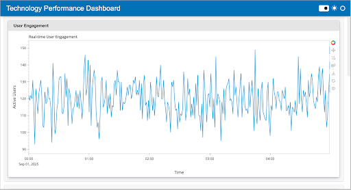
Anaconda AI Platform: Streamlining Enterprise Python Data Visualization
The Anaconda AI Platform provides a comprehensive foundation for Python-based data visualization in enterprise environments, addressing the critical challenges organizations face when deploying visualization solutions at scale. While Python’s visualization libraries offer powerful capabilities, enterprises require additional infrastructure for security, governance, collaboration, and deployment that the AI Platform delivers.
Enterprise-Ready Python Visualization Infrastructure
The Anaconda AI Platform enhances standard Python data visualization workflows by providing enterprise-grade capabilities that individual Python installations cannot match:
Secure Package Distribution: Unlike standard Python environments, the platform provides signed and verified packages with comprehensive security scanning, ensuring visualization applications meet enterprise security requirements without compromising access to cutting-edge libraries.
Streamlined Environment Management: Automated dependency resolution and environment consistency across development, testing, and production systems eliminate the common challenges of compatibility issues that plague traditional Python deployments.
AI-Assisted Development Tools: Integrated coding assistance and intelligent error detection specifically optimize Python data visualization development, helping teams write better code faster while avoiding common visualization pitfalls.
Enterprise-Grade Security and Governance
The Anaconda AI Platform addresses critical enterprise requirements for data visualization:
Secure Package Management: Signed and verified Python packages reduce security risks, while detailed Software Bill of Materials (SBOM) provides complete auditing capabilities for compliance requirements.
Package Security Manager (PSM): Integrated common vulnerabilities and exposures (CVE) scanning and compliance tracking ensure visualization applications meet enterprise security standards while maintaining access to the latest visualization libraries and capabilities.
Automated Dependency Resolution: Conda automates package and environment-level dependency resolution, eliminating manual processes and ensuring consistent, reproducible visualization environments across development, testing, and production systems.
Collaborative Visualization Development
AI-Assisted Development: Integrated coding assistance accelerates visualization development through intelligent code completion, error detection, and optimization suggestions that improve both development speed and code quality.
Real-time Collaboration: Multiple team members can work simultaneously on visualization projects, with real-time synchronization and conflict resolution ensuring seamless collaborative workflows.
Best Practices for Python Data Visualization
Effective Python data visualization requires understanding both technical capabilities and design principles that create good data visualization experiences. Leading organizations like the New York Times demonstrate excellent examples of data visualization through their innovative approaches to presenting complex data in accessible, engaging formats.
Design Principles for Effective Visualization
Choose Appropriate Chart Types: Select visualization types that match data characteristics and analytical objectives. Line charts excel for time series data, bar graphs work well for categorical comparisons, scatter plots reveal relationships between variables, and heat maps effectively display correlation matrices.
Maintain Visual Consistency: Establish consistent color schemes, font choices, and layout patterns across all visualizations to create cohesive analytical experiences that support user understanding and navigation.
Optimize for Accessibility: Ensure visualizations work effectively for users with different abilities by using colorblind-friendly palettes, providing alternative text descriptions, and maintaining clear visual hierarchies.
Focus on Data Storytelling: Structure visualizations to guide viewers through logical analytical progressions, highlighting key insights and supporting decision-making processes rather than simply displaying data points.
Technical Implementation Best Practices
Handle Big Data Efficiently: Implement data sampling, aggregation, and streaming techniques to maintain visualization performance when working with large data sets while preserving analytical accuracy.
Optimize Interactive Performance: Design interactive data visualization features that respond quickly to user interactions, using techniques like data caching, progressive loading, and efficient rendering to maintain responsive user experiences.
Ensure Cross-Platform Compatibility: Develop visualizations that work consistently across different devices, browsers, and operating systems to maximize accessibility and user adoption.
Implement Proper Error Handling: Build robust error handling into visualization applications to gracefully manage data quality issues, connectivity problems, and user input errors without compromising application stability.
Integration with Modern Data Infrastructure
Python’s data visualization capabilities integrate seamlessly with modern data infrastructure, supporting real-time data processing, cloud deployment, and scalable analytics workflows that meet enterprise requirements for performance, security, and reliability.
Cloud-Native Deployment
Python visualization applications deploy easily to cloud platforms, supporting scalable infrastructure that can handle varying user loads and data processing requirements. The Anaconda AI Platform provides optimized deployment configurations for major cloud providers, ensuring consistent performance and security across different environments.
Real-Time Data Integration
Python’s extensive ecosystem includes libraries for connecting to streaming data sources, databases, and APIs, enabling the creation of dashboards that update continuously as new data becomes available. This capability proves particularly valuable for monitoring key performance indicators (KPIs), tracking operational metrics, and responding to changing business conditions.
API Development and Integration
Python visualization applications can expose APIs that integrate with existing business systems, enabling embedded analytics capabilities that bring visualization insights directly into operational workflows and decision-making processes.
Getting Started with Python Data Visualization
Organizations beginning their Python data visualization journey should start with clear objectives and gradually expand their capabilities as teams develop expertise and requirements evolve. The Anaconda AI Platform provides an ideal starting point, offering comprehensive tool access, security features, and collaborative capabilities that support both individual learning and enterprise deployment.
Learning Path Recommendations
Foundation Skills: Begin with Matplotlib and pandas to understand core visualization concepts and data manipulation techniques that form the foundation of all advanced visualization work.
Statistical Analysis: Add Seaborn capabilities to support exploratory data analysis and statistical visualization that reveals patterns and relationships within data sets.
Interactive Development: Progress to Plotly and Bokeh for creating interactive dashboards and web-based visualization applications that engage stakeholders and support self-service analytics.
Advanced Applications: Explore specialized libraries for specific use cases, such as geospatial visualization, network analysis, and real-time streaming applications that address unique organizational requirements.
Implementation Strategy
Start Small: Begin with simple visualization projects that address immediate business needs while building team confidence and demonstrating value to stakeholders.
Focus on User Needs: Prioritize visualization development based on actual user requirements and decision-making processes rather than technical capabilities or aesthetic preferences.
Iterate and Improve: Implement feedback loops that capture user experiences and analytical insights, using this information to continuously improve visualization effectiveness and user adoption.
Scale Gradually: Expand visualization capabilities systematically, adding new features, data sources, and user groups in manageable increments that maintain system stability and user satisfaction.
Transform Your Organization with Python Data Visualization
Python data visualization represents a strategic capability that transforms raw information into competitive advantages through effective data analytics, business intelligence applications, and data-driven decision-making processes. Organizations that effectively implement Python-based visualization strategies can respond more quickly to market changes, identify opportunities earlier than competitors, and make more informed decisions across all business functions.
The integration of Python capabilities with the Anaconda AI Platform provides organizations with unprecedented power to create sophisticated visualization applications that combine traditional analytical capabilities with advanced AI features, collaborative development environments, and enterprise-grade security and governance.
Ready to revolutionize your organization’s data visualization capabilities with Python? Request a demo to discover how the Anaconda AI Platform can accelerate your visualization development process, ensure enterprise security and governance requirements, and unlock the full potential of Python-based data analytics. Or get started for free to explore Python data visualization capabilities in your own environment and begin creating impactful visualization applications that drive meaningful business outcomes.